
The slides are here: [PDF].
Flip-books and Animation
Being able to move, animate, design elements adds a powerful and engaging new dimension works we create.We started by looking at how animation is made without a computer or code - using pen and paper.
We briefly looked at this video demonstrating flip-books work.
Each page of the flip-book has an image that is slightly different from the image on the previous page. When viewed in quick succession, an illusion of movement is created.
That idea is exactly the same for digital animation. We still create animation frames, each differing from the previous one by a small change.
The following shows three frames, each with a red circle which we can think of as a ball. On the first frame the ball is near the top of the frame. In the next frame the ball is slightly lower, and in the third frame it further down.

We want to draw these frames, which could easily be from a flip-book, using code. That means thinking about the ball as a circle() shape, and its location in terms of vertical coordinates.
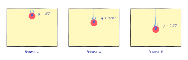
The picture shows the ball at y=50, y=100 and then at y=150. Although these are actually big jumps, the key idea is that the coordinates of the ball change with each frame.
With a flip-book, we flip each page so we seem then in quick succession. How can we do the same in code? How can we rapidly draw each frame?
We could do it manually, but p5js supports animation by providing an easy way to repeatedly call the main draw() function - the one which contains our instructions for drawing shapes and colours.

Have a look at the following simple code. We have the familiar setup() and draw() functions, with the simple.js library being initialised in setup(), and a very familiar circle() instruction in draw().
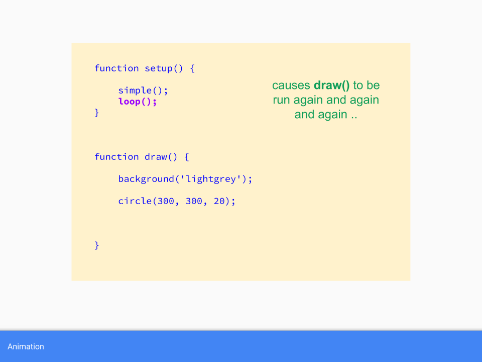
There are some new things in that code too. The loop() instruction in the setup section causes the draw() function to be called repeatedly. That's just what we need to repeatedly draw each animation frame. The background() instruction simply wipes the canvas clean with a background colour, which is just like starting a fresh new page of a flip-book.
We then turned our attention to actually drawing each frame of the animation. The following code draws a circle at (x, 300).

The important point is that x changes at every frame because it is increase by 5 inside the draw() function. Remember that draw() is called repeatedly, so x keeps increasing.
That x is initialised to 0 outside the draw() function. That means it is set before draw() is run, and is visible from draw().
Here are the results.

That worked!
Although the code, and the resulting animation, is simple - it contains all the key points fundamental to all animation:
- each frame is drawn in quick succession
- the drawing on each frame differs by a small amount
- viewed in quick succession, the frames give the illusion of movement
- incrementing/changing variables can be used to control the changing position of an object
- each new frame must be blank
We then saw how the speed of the ball could be controlled by changing the amount by which the x coordinate was incremented. Increasing it by 1 caused the ball to move slowly, and increasing it by 20 caused the ball to zoom by!
That concluded the introduction to creating animation with code.
Next we looked at mathematical function and how they can help with animation.
The Shape of Mathematical Functions
Mathematical functions are not something that everyone gets excited about, and some even view them with fear or impending boredom!Our treatment of mathematical functions wasn't about doing algebra or exploring mathematical proofs. We focussed only on their "shape".
We started with a very very simple function y = x+3. We looked at what y is when x is 0, 1, 2 and 3.

We saw that y takes on the values 3, 4, 5 and 6. For example, when x is 2, y = x+3 which is 2+3, or 5.
That was easy enough.
We wrote some code to draw a small circle at each of these points. We continued with the same code skeleton which used loop() to repeatedly call draw(), and commented out the background() instruction so we could see all the drawn circles.

The code simply draws a circle at every (x,y) where x starts at 0 and increased in steps of 5, and where y is calculated using the function y = x+3.
Here's the result.

The result is a straight line. If you're familiar with some maths, you won't be surprised that the linear function had a straight line shape.
We then looked at y = x2. A table of x and y values shows that y grows big rather quickly.

Here's the result.

The circles fall off the canvas very quickly - because the y values grow large every quickly. When x is 10, y is 100. When x is 100, y is 10,00!
We need a way to slow it down. A very common technique is to scale x by dividing it. We tried dividing it by 20.
The following shows y=(x/20)2. The y values are much smaller.

The results are interesting.

This function has a shape that isn't a straight line, but is a curve that seems to speed up after a slow start. That shape is actually a parabola and the function is of a type called a quadtratic function.
Even with this simple example, we can see the possibilities for modelling a ball falling down, or a colour gradient that changes rapidly after a slow change.
We then looked at another function, called a sine function.
We also used a website that makes drawing the shapes of mathematical functions really easy. This link shows the sin() function being drawn: https://www.desmos.com/calculator/seoidaqekt

We don't need to talk about trigonometry or angles or do any algebra. All we need to do is appreciate the shape - which is a nice up and down wave! That should be really useful.
Changing our code to draw circles at every y=sin(x) gave an unexpected result. This was because the sin() function varies from -1 to +1, so not very tall at all. We can scale it by multiplying by 100. We also shift the coordinates to the middle of the canvas.

The result confirmed the wavy shape.

By blanking the canvas again, we can create an undulating motion.

This shows how we can use mathematical function to control the motion of objects in an animaition - without needing to be an expert in doing algebra or analysis - we just need to apreciate the shape of the function, and tools like the desmos website make this really easy.
We looked at a few more mathematical functions because they have useful shapes.

The following shows the tanh() function, which starts at 0 and rises towards 1 but never gets there. That can come in handy, especially when dealing with values that can grow indefinitely.

The following is an exponential decay exp(-x2). It's the perfect shape for a smooth rolling off.

We can combine these function to combine their shapes. The following combines the waves of a sine function and the roll off of an exponential decay exp(-x2)*sin(10x).

We can even create a train of pulses which themselves contain pulses. You can explore it here: https://www.desmos.com/calculator/9lsgxqfxau.

As an example of using these functions, the following shows a colour field creates by mixing amounts of red, green and blue that follow the values of a sine wave.

We looked at a more interesting example. The size of the randomly placed circles increases and decreases as we move out and away from the centre of the canvas. In fact the circle size is determined by a sine wave!

You can explore the fairly simple code yourself: https://www.openprocessing.org/sketch/677344
More Examples
We looked at more examples of animation where the motion of key elements is determined by a mathematical function.This is a simple example which follows on from the code we wrote in the session.

The animation seems to show the motion of a ball as it bounces up and down, losing momentum and then rolling along the floor. The motion is actually a sin wave combined with an exponential decay. That's it - nothing more complicated than that. Yet the result is fairly realistic. The bounce is achieved by taking the absolute (positive) values of the damped wave, so the ball never falls before the green floor.
s
We noted that a more realistic physics simulation would use a slightly different approach using speed and gravity which results in a parabola rather than a sine wave.
The next example follows the motion of many small particles, which start with a random initial velocity and move according to this velocity as well as the influence of gravity. The overall results look like fireworks.

Although the motion is parabolic, the maths we use to follow the motion is simply adding speed to a location, which is very simple but sufficiently valid Newtonian physics. You can read more about this particular simulation here [PDF], and see the code here: https://www.openprocessing.org/sketch/682243.
A more involved example uses a different kind of mathematical function, Perlin noise, which is a smoother form of randomness. In this animation we follow the path of ants which move according to this not-so-random noise.

You can explore this slightly more involved code here https://www.openprocessing.org/sketch/687126.
Finally we looked at an example where the motion is based on noise, but repeats smoothly because the underlying parameters that feed the noise function are taken from a looped path on the parameter space.

In this example the noise parameters move around a unit circle so the noise itself does repeat smoothly, and this leads to the tree moving smoothly too. The gif above doesn't show that, but the actual animation does: https://www.openprocessing.org/sketch/687189.
Conclusion
Most of the members attending were fairly confident coders so the beginner-focussed introduction to coding was likely something that was already understood.The later themes combining mathematical functions, and in particular using noise seemed to be of interest.
We've now held a few beginner-focussed sessions in Cornwall now, and I feel going forward we'll proceed to explore more sophisticated topics, whilst still keeping them accessible so that newcomers always have something they can take away.
References
- Another blog I wrote on animation: http://makeyourownalgorithmicart.blogspot.com/2018/05/introduction-to-animation-with-p5js.html
- Previous meetup exploring creative uses of Perlin noise: https://algorithmicartmeetup.blogspot.com/2018/08/creative-uses-for-not-quite-random-noise.html
- How Perlin noise is actually calculated: http://makeyourownalgorithmicart.blogspot.com/2018/02/randomness-and-perlin-noise.html


